House color visualizer: build a whole-house color scheme

A good exterior scheme is three or four colors working together. Test body, trim and door combinations on your house before you commit to any of them.

Start with a photo of your house

Add a photo of your house

or drag a photo here.

For the best result

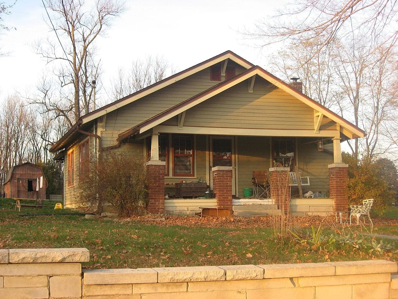
A good example: the whole front of a bungalow, straight on, in daylight
Whole front in frame, from across the street
Daylight, no harsh shadows
Location data removed before storage

Start with what is not changing

Most houses have fixed elements: a roof with 10 or 20 years of life left, brick or stone on the front, window frames, a concrete or interlock driveway. These set the undertone of the scheme, so list them before choosing anything new.

Hold a white sheet of paper next to the roof or brick in daylight. Against white, it is easier to tell whether a brown roof leans red or grey, or whether a stone has yellow or pink in it. Then pick body colors that share that warmth or coolness.

Give each color a job

A simple rule of thumb is roughly 60 percent body color, 30 percent trim and 10 percent accent. The body covers the walls, the trim outlines windows, fascia and corners, and the accent is usually the front door, sometimes shutters.

  • Body: the color neighbors will describe your house by. Mid tones are the most forgiving; very light and very dark bodies show dirt and fading more.
  • Trim: either contrast (white on navy) or tone on tone (a shade darker or lighter than the body) for a quieter look.
  • Accent: the place to take a risk. A door is easy to repaint if you tire of it.
  • Roof: count it as a color. A black roof pushes a scheme toward contrast, a brown roof toward warmth.

Contrast level sets the style

High contrast, like white body with black windows, looks crisp and modern but shows every flaw in proportion. Low contrast, like greige body with slightly lighter trim, flatters houses with awkward window placement and suits traditional streets.

Look at your street from the sidewalk. A scheme does not need to match the neighbors, but one that relates to them in value usually looks more settled than one that fights them. Houses in heritage districts or with an association may have a published palette; start from that list.

Testing a scheme for real

After you narrow to one or two schemes on screen, paint sample boards for body and trim and place them together, trim board overlapping the body board, so you see the edge where they meet. Colors interact; a white can look grey next to a strong body color.

View the boards on the actual front of the house at several times of day. Light from the north cools everything; light from the west warms it in the evening, which is when many people see their house coming home.

Common scheme mistakes to avoid

The most frequent problem is a body color chosen in isolation that fights the roof. A cool blue-grey body under a warm brown roof, or a creamy yellow under a black roof, will look off no matter how good each color is on its own. Render the scheme with your real roof visible before sampling anything.

The second is too many accents. Shutters, door, garage, railings and planters in different colors break the house into pieces. Pick one accent and repeat it at most twice. Finally, remember gutters and downspouts: they run the full height of the wall, so paint them to match whatever they sit against, usually trim at the eaves and body color on the walls.

Color combinations to try

Navy with crisp white

body
Deep navy
#273548
trim
Bright white
#F4F5F2
door
Ochre
#C39A3E
roof
Charcoal shingle
#3E4247

Classic and confident; the ochre door keeps the navy from feeling cold.

Warm white and wood

body
Warm white
#EFE9DD
trim
Soft black
#25272A
door
Natural cedar
#A8714A
roof
Charcoal metal
#3E4247

A modern farmhouse scheme that softens contrast with a stained wood door.

Sage and cream

body
Sage
#9DA88E
trim
Cream
#E9DFC6
door
Barn red
#7A2E26
roof
Weathered grey
#77777A

Calm and garden friendly, good for cottages and craftsman houses.

Charcoal and copper

body
Charcoal
#3E4247
trim
Charcoal
#3E4247
accent
Copper
#9C5B33
roof
Black
#141516

Tone-on-tone dark body and trim, with a metal accent for modern houses.

Greige with blue door

body
Greige
#B8AE9C
trim
Linen
#DCD3C1
door
Harbor blue
#4A6378
roof
Driftwood blend
#8B8173

A low contrast neighborhood-friendly scheme that suits brown or tan roofs.

Hex codes are approximate on-screen matches. Enter any of them in the visualizer's color code box to try it on your house.

How to test a house color scheme

  1. Upload a front photo

    Use a straight-on daytime photo that shows the walls, trim and front door clearly.

  2. Set the body color

    Choose paint or siding for the walls and pick the main body color, or enter a hex code from a chip.

  3. Add trim and door

    Add trim and the front door as second and third changes, so the whole scheme renders at once.

  4. Compare schemes

    Use the slider to compare against your current house, render one or two alternate schemes, and download the ones worth sampling.

Frequently asked questions

How many colors should a house exterior have?

Most schemes use three: body, trim and one accent, with the roof counted as a fixed fourth. Large or ornate houses sometimes add a second trim color. More than that can look busy from the street.

Can I change body, trim and door in one render?

Yes. You can combine up to three changes in a single render, such as wall paint, trim and front door. That is enough to judge most schemes at once.

How close is the render to real paint?

It is an AI approximation, and your screen, the photo's lighting and the time of day all affect how color appears. Treat the render as a way to rule schemes in or out, and confirm the final colors with physical samples on the house.

Should trim be lighter or darker than the body?

Either works. Light trim on a darker body is the most traditional look. Darker trim on a light body reads more modern, and tone on tone trim is the quietest option.

Do I need to match my neighbors?

No, but similar lightness to nearby houses tends to look settled. Some heritage districts and associations do regulate colors, so check before you finalize.

Updated October 29, 2026.